Markguide is a living style-guide, pattern library, guidelines, and documentation static site generator with plugins support. It generates documentation from markdown files and documentation comments in scss files.
It is opinionated because it is probably impossible to cover all cases in CSS/Sass. It is designed primarily as a "style-guide driven development" tool with a focus on split files approach and encapsulated components with normative Sass import structures.
This documentation provides an overview of the folder structure for this project, including the purpose of each folder and its contents.
This folder contains SCSS example files and static HTML file destinations.
|-- custom-plugins
|   `-- dummy
|-- markguide-static
|   |-- assets
|   |-- images
|   |-- scripts
|   `-- styles
|-- projects-static-files
`-- scss-source
    |-- blocks
    |-- components
`-- configurationThis folder contains miscellaneous helper scripts.
This folder contains CSS and JavaScript files for the static HTML files.
This folder contains the executable files for the project's modules.
This folder contains SCSS files for the style guide only.
This is the main folder that contains all the modules' JavaScript files.
|-- config
|-- models
|-- plugins
|   |-- colors
|   |-- icons
|   `-- typography
|-- utils
|   `-- template-helpers
`-- views
    |-- includes
    |   |-- markdown
    |   `-- partials
`-- templates- Blazing fast thanks to Mustache and Marked. It is primarily designed as a development platform.
- Supports incremental builds, so only changed pages are updated.
- Can be set up with livereload.
- Small list of dependencies:
- ansi-colors
- fancy-log
- lorem-ipsum
- marked
- mustache
- pug
- All internal templates and styles can be overwritten on the project level.
- Can be used as a simple guide docs generator.
Support /*md comment in scss files where regular markdown could be placed.
- consists of 3 main types of pages - component, guide could be expanded to many different types;
- navigation tree copy project tree, to ease of orientation and handling huge components library;
- plugins;
Support regular markdown files in components folders and process it as guideline pages.
- markdown support;
npm install markguide.markguiderc.json:
{
    "guideSrc": "_example/scss-source",
    "guideDest": "_example/markguide-static",
    "cssSrc": "assets/css",
    "projectStaticFiles": "_example/projects-static-files",
    "projectImagesFolder": "images",
    "projectStylesFolder": "",
    "projectScriptsFolder": "",
    "projectFontsFolder": "fonts",
    "projectStyles": [
        "styles"
    ],
    "projectScripts": [
        "main"
    ],
    "internalAssetsPath": "assets",
    "customPluginsPath": "_example/custom-plugins",
    "enabledPlugins": [
        {
            "name": "icons",
            "options": {
                "iconsFolder": "icons",
                "fileExtension": "svg"
            }
        },
        {
            "name": "colors",
            "options": {
                "filePath": "configuration/_colors.scss"
            }
        },
        {
            "name": "typography",
            "options": {}
        },
        {
            "name": "dummy",
            "options": {
                "filePath": "file.html"
            }
        }
    ],
    "projectFonts": [
        {
            "filename": "roboto-regular.woff2",
            "properties": {
                "family": "Roboto",
                "style": "normal",
                "weight": "400"
            }
        },
        {
            "filename": "roboto-bold.woff2",
            "properties": {
                "family": "Roboto",
                "style": "normal",
                "weight": "700"
            }
        }
    ]
}
Then in package.json
{
  "scripts": {
    "build-styleguide": "markguide --build=./path/to/config.json"
  }
}In path/to/scss/style.scss:
/*md

# Component name

Component description.

Component example (Add one more backtick to make this example works):

``html_example
<h1>Some</h1>
``

``pug_example
h1 Some
``
*/

.regular-scss-here {
    margin: 0;
}npm run ???const markguide = require('markguide').withConfig('./project/root/path/to/config.json');
// or markguide = require('markguide').withConfig({ rawConfigObject });
markguide.build().then(...); // build all guide files without reports. Returns promise.
markguide.build('/absolute/path/to/changed/file.scss').then(...); // compile only particular file, if it marked as documented in project tree. Returns promise.
markguide.buildAll().then(...); // compile all guide pages. Returns promise.Use markguide.build() for incremental development builds.
Usage: markguide [OPTION]

Options:
  -b, --build=FILE           build all markguide pages, followed with config '--build=./path/to/config.json'
  -v, --version              print version
--help print this messageRequire explicit configuration in .withConfig() method.
Minimal configuration:
{
    "guideSrc": "path/to/yours/scss/",
    "guideDest": "path/to/your/static/folder/for/guide/",
    "cssSrc": "assets/css/"
}
You could place it wherever you want and target with:
const markguide = require('markguide').withConfig('./from/project/root/path/to/my/config.json');or with rawConfig object if you call markguide from js:
const markguide = require('markguide').withConfig({
    guideSrc: 'path/to/yours/scss/',
    guideDest: 'path/to/your/static/folder/for/guide/',
    cssSrc: 'assets/css/'
    // etc
});As the next step you, probably, want to add your project CSS and JS to render components examples properly.
To make this happen you need to add partials to the config, with paths to the templates in your project space:
{
    "partials": {
      "assetshead": "project-root/path/to/project-head.mustache",
      "assetsfooter": "project-root/path/to/project-footer.mustache"
    }
}
Note, that paths should be related to generated HTML, no matter where templates are stored. This is simple include that will be incorporated into resulted html.
All templates and partials could be overwritten. Please see this repo views folder to get list of all templates and partials.
{

}- !
guideSrc{string} – path to scss files that documented. It is not mandatory that it should be scss root, it could be any folder, but in this case you need to additionaly providescssSrcfor statistic reports. - !
guideDest{string} – path to generated files folder. - !
cssSrc{string} – path to generated CSS. Used for statistical reports. scssAdditionalImportsArray{array} – array of additional sass imports, if they used. Needed for statistical reports and styleguide auto generation.componentPrefixes{array of strings} – ['component', 'container'] prefixes that used for components and containers on project. It used to properly guess component types in component structure info (in footer). Ex:['c-', 'l-'],['markguide-', 'l-']excludedCssFiles{regexp} – CSS files that would not be processed in statistical reports.excludedSassFiles{regexp} – Sass files that would not be processed in statistical reports.excludedDirs{regexp} – directories that will be excluded from doc sets.createDestFolder{bool} - create destination directory if it is not exist. Default iffalse.indexPageSource{string} - path to custom markdown file that will be used in index.html. Otherwise markguide try to find README.md in guide src and in the root of the project.templates– use this field to use your own templates for guide generation.includes– use this field to use your own partials and includes.projectInfoname{string} - custom name of the project. Otherwise package name will be used.
Add this comment to the scss file and it file appears as component page.
/*md

# Component name

 */
Inside this comment regular markdown syntax would used, so any valid markdown will work here.
/*md

# Heading level 1

## Heading level 2

## Heading level 3

Regular paragraph with **bold**, _italic_ and `inline code`.

* list item
* list item
* list item

1. ordered list item
2. ordered list item
3. ordered list item

etc.

*/It extends markdown code block "fences" notation with custom type (just like Hologram) -- html_example and pug_example.
That render component html instead of code-example. This keeps documentation compatible with regular markdown.
To create component example you need to add code-block with html_example:
add pug_example
/*md

``html_example
<h1>Add one more backtick to make this example works</h1>
``

*/Simple html, scss, css "fences" become regular code-block:
/*md

``html
<h1>heading 1</h1>
``

``scss
.some { maring: 0; }
``

*/To inline some resources like svg icons, inlined styles etc. you could use inline helper. Ex:
{{#inline}}project-root/assets/src/images/icons.svg{{/inline}}This helper use path to file from your project root. Virtually any file could be inlined.
Simply put regular markdown file to components tree and they automatically become part of the markguide.
Regular development flow could be organized in this way – build all guide pages on start and incrementally rebuild pages on file changes:
const markguide = require('markguide').withConfig({config: 'here'});
markguide.build().then(...); // build all guide files without reports

// watch for changes, get changed file path and build needed page:
markguide.build('/absolute/path/to/changed/file.scss').then(...); // compile only this file if was documented on module importSee example guideline page or this repo gulpfile.js to get the idea how live reload and incremental builds could be set upped.
Due to time efforts reports not generated in regular flow. To generate reports you need to call npm markguide --build
or in JS:
const markguide = require('markguide').withConfig({config: 'here'});
markguide.buildAll().then(...); // compile all components, guidelines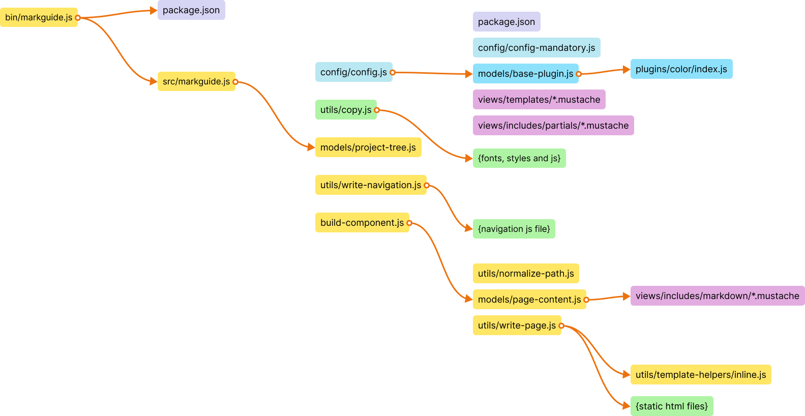
This is done intentionally. It all designed for 1 component 1 scss file structure. Otherwise it is very hard to keep components readable and supportable.
You are welcome for ideas, help and of course code contributing. Please see CONTRIBUTING for more details.
Published under MIT license.